Air Canada has just announced a pretty big rebranding, which includes a new livery for their planes, and new employee uniforms.
Air Canada’s new livery
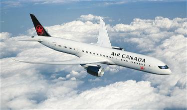
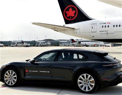
Here’s a picture of Air Canada’s new livery on a 787:

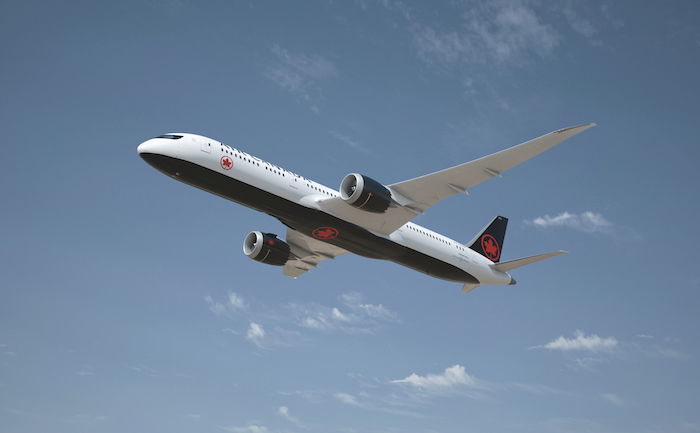
Three planes have already been repainted, and should be flying shortly. Here’s how the inspiration behind the livery is explained:
Our new livery signals another pivotal transition point in our 80-year history and celebrates a major branding project for a globally recognized Canadian company. Together with our new uniforms, improved international cabin standard and enhanced on-board products, the future of Air Canada represents the strength of our nation and the future-looking spirit of our airline through distinct references to Canadian culture, heritage and evolution. From small regional airports to major international hubs, wherever we land, we fly the flag with care and class.
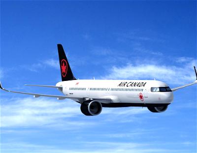
Air Canada’s fleet of 300 mainline and regional aircraft are being repainted in a bold black and white design that highlights its iconic red maple leaf encircled ensign, or “rondelle,” that returns to the tail of the flag carrier’s fleet after an absence of 24 years. Reflecting Canada’s vastness and contrasting seasons, with references to its wildlife and First Nations heritage, the new fleet livery was designed by international design firm Winkcreative, headed by Canadian entrepreneur Tyler Brûlé. Following today’s events, the first three aircraft sporting this new livery will enter service immediately.
And then here’s a video about the inspiration for Air Canada’s new livery:
Before I share my thoughts, let me say that I really like Air Canada’s old livery. I find it to be one of the sharpest and cleanest liveries out there. It stands out in a subtle way.
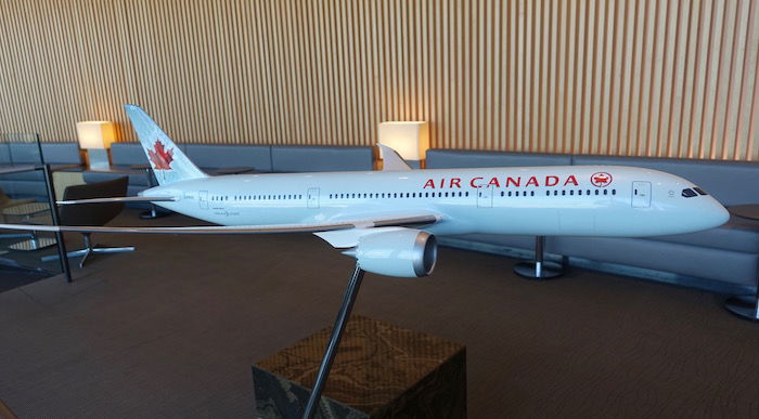
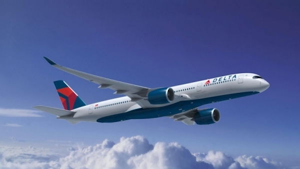
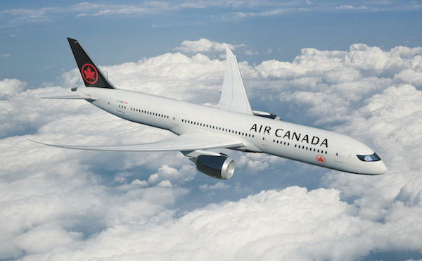
Most new liveries take some getting used to, and the new Air Canada one is no exception. I think it’s sharp and a bit bolder, though at the same time I can’t help but think it looks very similar to Delta’s livery… is it just me?
Air Canada’s new employee uniforms
As I mentioned above, Air Canada has also unveiled new employee uniforms, which we should see later this year. Here’s how they’re described:
Air Canada premiered elegant charcoal grey and black employee uniforms with red accents and accessories by Canadian designer Christopher Bates. The stylish uniforms combining urban chic and international flair complement the charcoal greys, natural tones and red accents featured in the new interior cabin design of Air Canada’s international fleet. The airline’s pilots, flight attendants, airport customer service agents and other uniformed personnel comprising approximately two-thirds of its 30,000 global workforce will start wearing their new uniforms later this year.
And here are some pictures:
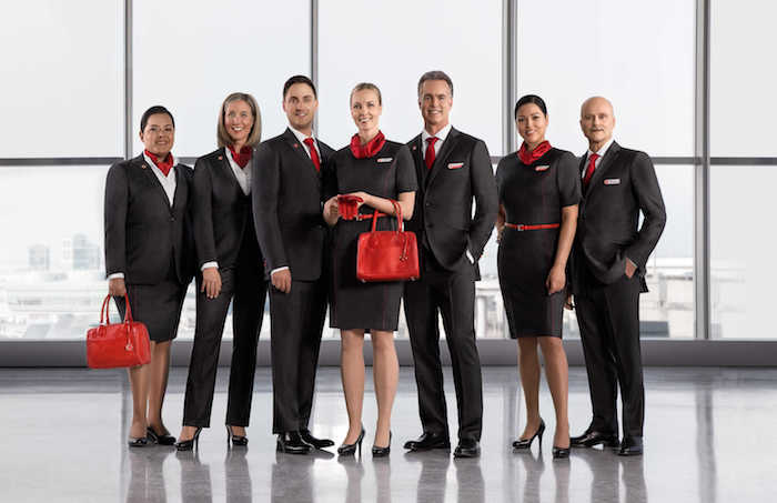
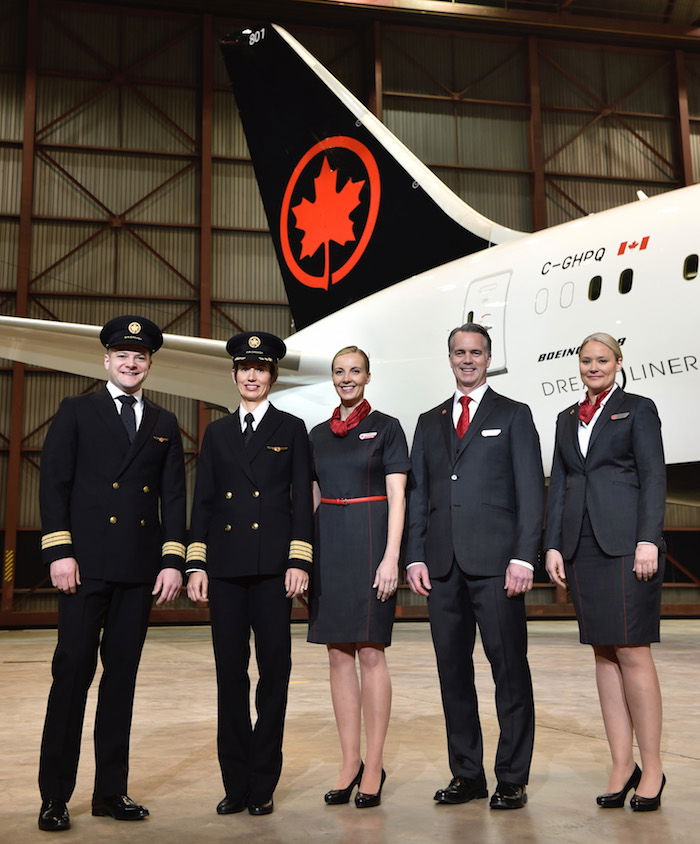
To me the uniforms look sharp but somewhat bland.
Bottom line
In general new airline liveries take some getting used to. This one is no exception. I think Air Canada’s old livery was fantastic. While I think the new one looks sharp, at first glance it looks almost exactly like Delta’s.
What do you make of Air Canada’s new livery and employee uniforms?

Bring back original air canada red and white livery from 1980
OH and Tyler Brule who was head of the Winkreative that did the rebranding for the logo IS Canadian Born.
Wow, I read some of the comments and I got to say.. WOW. Is it really hard to understand all the subtle nods and hidden meaning and emotions beside the new rebrand? This rebranding really elevated air canada to a different level and really show the forward thinking and the pride and love for being Canada's national aircraft. Everyone is a downer on the new brands. Guess you can't handle the changes.
By the way,...
Wow, I read some of the comments and I got to say.. WOW. Is it really hard to understand all the subtle nods and hidden meaning and emotions beside the new rebrand? This rebranding really elevated air canada to a different level and really show the forward thinking and the pride and love for being Canada's national aircraft. Everyone is a downer on the new brands. Guess you can't handle the changes.
By the way, the icy blue livery is SOOOOO 2000s.
oh and to "True Canadian", explain to us why we have Queen Elizabeth on our 20 dollar.
the uniforms are very stiff looking
Who the hell cares whet the planes or the staff look like. I want my flight to be on tome, my seat to be correct, my bags to be there when I arrive and I want it all done with courtesy. Not too much to ask, I think.
Air Canada's "pay for all checked luggage" policy now has idiots trying to cram as much as they can int their carry-on bags, which is creating...
Who the hell cares whet the planes or the staff look like. I want my flight to be on tome, my seat to be correct, my bags to be there when I arrive and I want it all done with courtesy. Not too much to ask, I think.
Air Canada's "pay for all checked luggage" policy now has idiots trying to cram as much as they can int their carry-on bags, which is creating chaos. Unfortunately, Air Canada has no solution for this. Well I do: At check-in, make the passengers put their carry-n pieces through a sizer, so they know at that time if it will fit or not. Make it a strict rule. It doesn't fit the sizer, it has to get checked (and paid for). Also, make the number of carry-on items a hard and fast rule and stop letting people carry on multiple items. They are shoving their bags, etc., all over the cabin and creating chaotic delays.
Really disgusted that Canada’s national carrier decided to use a UK agency to rebrand. Way to show your patriotism Air Not Canada.
First of all: HUGE congratulations and thanks to Ana Bianchi, I've always adored the current ice-blue livery! Air Canada had the best with that paint job, it was visible from a good distance and was by far the most subtly classy livery on the tarmac or in the air. I loved it!
My thoughts on the new one: Not as good as Ana's, for a certainty. It may grow on me after I see...
First of all: HUGE congratulations and thanks to Ana Bianchi, I've always adored the current ice-blue livery! Air Canada had the best with that paint job, it was visible from a good distance and was by far the most subtly classy livery on the tarmac or in the air. I loved it!
My thoughts on the new one: Not as good as Ana's, for a certainty. It may grow on me after I see it a few times though. I don't really like the black belly, it seems a bit boring. They should have kept it white and made a more interesting tail, maybe something more like Rouge??? I think Ana Bianchi actually summed it up very well, 'no spirit'. The old livery had a lot of personality, if you know what I mean.
I guess this doesn't make a huge difference with me, Air Canada always has and always will be my favorite airline.
Wow, Ana, nice job on the ICE BLUE livery...my favourite. I find it hard to believe that with paint technology constantly advancing that this livery could not be saved. You always could spot an Air Canada plane on the ground or in the air from a fair distance.
As for the new livery, I like it. I think it will look amazing when I see it in person. Reminds me of a tuxedo. The...
Wow, Ana, nice job on the ICE BLUE livery...my favourite. I find it hard to believe that with paint technology constantly advancing that this livery could not be saved. You always could spot an Air Canada plane on the ground or in the air from a fair distance.
As for the new livery, I like it. I think it will look amazing when I see it in person. Reminds me of a tuxedo. The black mask is great and will look great on the smaller planes especially the C Series. I am not a fan of the black font however- could we go back to the 70's AIr Canada font? That looked great in black.
As for the uniforms, as long as they make the staff look and feel good, then who cares what they look like? Its smart and clean with a touch of red to make it relevant. Yes, its conservative but so what?
Well - I kind of agree with Bretton. I like, I dislike, I like, I dislike . . . and so on.
Right now, first impression - clean. But, like many other 'clean' designs through history it can come across as somewhat bland compared to its visually stimulating predecessor. That is often why 'clean designs' are perceived as timeless and boring - they tend to be simple, often lack ornamentation (which ironically is why...
Well - I kind of agree with Bretton. I like, I dislike, I like, I dislike . . . and so on.
Right now, first impression - clean. But, like many other 'clean' designs through history it can come across as somewhat bland compared to its visually stimulating predecessor. That is often why 'clean designs' are perceived as timeless and boring - they tend to be simple, often lack ornamentation (which ironically is why they look clean) and they tend to be somewhat timeless.
Is it as distinctive as Ana's cool icy blue? - IMO, no (and remember, there were many distractors when that came out as being 'too' edgy and different too - very un-Air Canada. . . !) But the new design may be more in keeping with current times and AC's expanding worldwide network. The new livery IMO is more conservative (nothing wrong with that. . . is that 'the' link to Canadian-ism?) and not as graphically vibrant. But in general - it is probably a safer global solution and safer is rarely leading edge - especially to designers. Only time will tell if it is as iconic as the last one had become.
Five or ten years from now most everyone will have accepted it as having been there forever. Then AC will stir the pot and change liveries again!
I think the new livery and uniforms are great! Classy and polished! It's about time we got rid of the pike light green.
The new Aircraft look is awesome, The colours are just great and the Maple Leaf on the belly
of the aircraft is awesome.
The staff uniforms are great too.
Thumbs up Air Canada
Agree with others here...a rehash of the 1990s livery. The rondelle is great to have back, but the type on the fuselage should be in red at least... what does black have to do with anything Canadian? This is piss poor designing. Very unoriginal. Ana's livery was much more unique.
I'd rather AC better manage their supply of food for sale in economy than waste resources repainting their aircraft.
I am actually the designer that created the sparkly blue livery. Thank you for your words about my work. It is not only a sad thing to see my favorite piece of work go away, it is awful to see it go for a black and red design with no spirit.
Long time reader, first time commenter, here. I really like what has been said above. What was presented yesterday was nowhere near what I expected AC to do. I have spent the last 24 hours just staring at the images of the new livery and I have gone the whole spectrum from really liking it to really hating it and back again. Right now, I think I've landed on acceptance.
My favourite thing about...
Long time reader, first time commenter, here. I really like what has been said above. What was presented yesterday was nowhere near what I expected AC to do. I have spent the last 24 hours just staring at the images of the new livery and I have gone the whole spectrum from really liking it to really hating it and back again. Right now, I think I've landed on acceptance.
My favourite thing about the ice blue livery is that it stands out in a sea of white liveries; however, blue is not in the AC colour palette any longer, so I do think a change is refreshing.
I love the return of the rondel to the tail. The red against the black is quite striking and bold. What I think is most jarring about this livery is the Air Canada type on the fuselage in black. Again, I've come to acceptance, but I can't help but think if it was in red it would better embody AC.
Also, looking at the illustrations of the livery on their other aircrafts, I think it works well. Just doesn't fit with the 787, unfortunately.
I don't like it at all. Looks outdated and old and they paid so much money to "designers". Don't we have better designers and more creative people in Canada? Why they took steps back? Red and black are funeral colors. Moreover the uniform also should be more attractive and presentabe. Desapointed.
Their only inspiration is the CFL team in Ottawa, the RedBlacks.
Still Prefer the Ice Blue and the Rouge liveries.
a bit unsure how i feel about it... looks kind of bland, but it also kind of reminds me of the old BA landor livery at first glance, which i like...
I like the font and the position of the logo on the front. Other than that, it's a big pile of meh. The black doesn't say "Canada" at all, and the fuselage needs a cheat line or something to break up all the white.
Would look better if they just took the current livery, replaced the generic maple leaf on the tail with the "rondelle" and changed the font for the name. And perhaps gone with a white belly.
I really like the changes. I just flew Air Canada the other day and could help but think the livery was starting to look a little dated. There was also a really young, attractive flight attendant who looked slightly embarrassed/insecure about his uniform, which was ill-fitting to say the least.
very unimpressive the new livery. BTW... its not so new, its only a refresh from the livery they had before the current crisp unique livery. Their earlier A-320's and even 747-400's sported that livery. And Ben is right, it looks too much like Delta and is nothing unique. Their current livery is too much nicer. Shame they didn't refresh their current livery and instead opted to refresh an older livery.
My first thought was "its a DL airplane". Also not quite sure how they see black as part of the Canadian landscape. As for the Raccoon eye shadow for the cockpit windows well...
It is a white aircraft with black engines and tail on which there is a red maple-leaf. Period.
and same designer as current Swiss livery and branding. Uniforms are a huge missed opportunity to do something interesting, stylish.
Actually the 1990s tail was very dark green, not black.
It looks like they're attending a funeral.
Showed my brother the images and his first response was "The new Air Canada looks like Delta".
what!? anyone who also thinks the next 'new' is a step backward from the Ice Blue livery its predecessor?
looking at the archives this is just the 1990s era black livery with a circle around the leaf on the tail.
The prior tail logo with no circle was like Deltas wavy flag tail.
Now like Delta did 10 years ago they're doubling down on the logo in its purest form.
But didn't AC have black livery at some point before?
More skin please, more skin. I think flight attendants should be encouraged to wear cocount bras on duty
The old livery was better IMO - the new one is Delta-ish but not as nice. The double breasted captain and first officer uniforms look like US Naval Officer dress uniforms. And the FA uniforms are boring. Maybe all this will improve with time.......
Stop wasting money on paint jobs. The AC fleet is fine as is. Spend on interior maintenance. Or better yet, work with Aeroplan to hire more reps - their wait times must be the worst in the industry..
@Brian Kusler - Lucida Sans Bold ?
http://fontslogo.com/air-canada-logo-font/
Dull. Especially the uniforms.
Reminds me of delta but I like that they are painting the belly
This new livery looks just like the one they had before the current (old) livery. Not like Delta's
I think Delta uses Whitney. I can't tell what font this is, though. Maybe a custom word mark that evolved from Taxon? Does anyone know?
Love the contrast, I think it looks great
I love the 'rondelle' maple leaf design, a very nice improvement. The rest of the colors aren't all that big a deal.
Very reminiscent of the old livery seen on its 747-400's. I like.
Firs time commenter here. In my humble Canadian opinion, Air Canada is trying to say: welcome to the 80's. But hey, they're always the most expensive (by much), so it's not like I'm gonna notice the difference anyway.
I like the new livery but also thinks it looks a lot like Delta
I think that the current (soon to be old) livery was beautiful. I also prefer the Air Canada Rouge tail to the new one. I wish they had mixed some of those elements into the new livery. The new livery is nice but boring.
I will miss the ice blue. It really stands out.
This new look is OK. Nothing earth shaking about it. I suppose there's only so much you can really do with something like this, but overall it seems pretty boring. The belly is best part about it., but if they really wanted to do something more interesting they could have made the belly red with the white leaf logo in the middle.
Much rather the money was spent on in flight improvements. Who care what the paint on the outside looks like, especially since it's not that different from the existing livery?