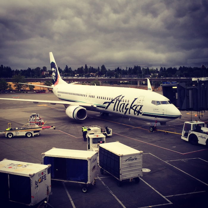
Seattle-based Alaska Airlines has been undergoing quite a transformation lately, which they’ve called “Alaska Beyond.” At some point they realized they were a bit behind the times, so they started improving their onboard product a bit, perhaps largely pressured by Delta’s invasion of Seattle. Beyond that, Alaska is introducing extra legroom seating in economy, and also greatly increasing legroom in first class throughout much of their fleet.
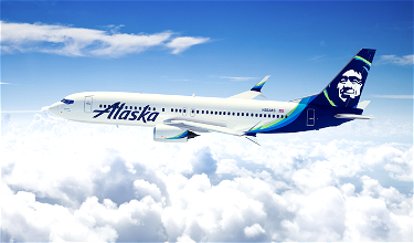
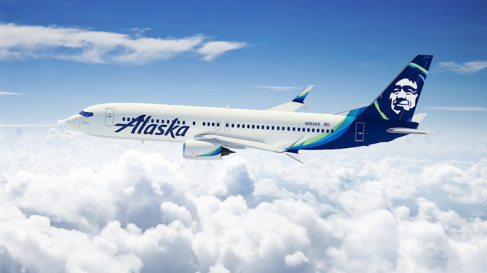
Yesterday they took it a step further, as Alaska announced their biggest rebranding in 25 years. We’ll be seeing new airport signage, a new livery, a refreshed website and mobile app, and more. Here’s Alaska’s new livery:
It’s sort of funny how quickly my feelings towards the new livery changed. At first I was quite put off by it, as it looked a bit like American Express Bluebird and the Seattle Seahawks had a baby. But then I watched this video by Alaska’s VP of marketing:
Once I watched it I was sold. The eskimo is the most iconic part of the Alaska Airlines brand, but with the old branding he never really looked happy. As is explained in the video, the starting point with the rebrand was that they wanted to accentuate his warmth, kindness, and the care he has in his face. And I think they nailed that, because the eskimo looks sort of like a proud father.
The colors take some getting used to, but that’s almost always the case when there’s a rebrand. While I sort of liked the old Alaska branding, I also think it was outdated, so a fresh start was needed.
In addition to updating the eskimo, Alaska has also updated the font they use. The changes are quite deliberate, though I think they’re reading into it a bit too much:
“The clean lines and italics of our updated wordmark represent the performance and precision our customers have come to expect when they fly Alaska, from our pioneering 20-minute baggage guarantee to our industry leading on-time performance,” said Woerner.
It was also important to the company to keep some equity from the wordmark that Alaska’s customers have come to know. The capital “A” in Alaska has been streamlined, but is otherwise very similar to earlier versions.
“It was a balance between taking what makes us who we are, and finding a way to modernize it with energy, life and confidence.”
It’s not just the planes themselves which are getting a refresh, but just about every aspect of their product, from their website to their credit card to their airport signage:
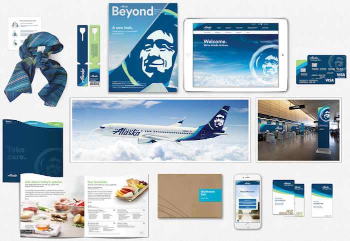
Here are the new Alaska Mileage Plan elite cards:
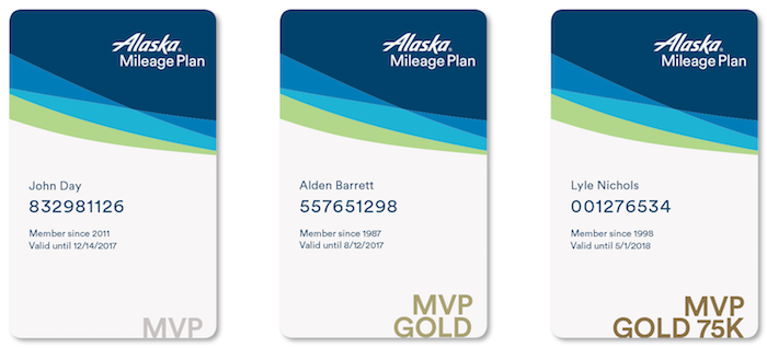
Now I’m reading way too much into things, but I found this to be the most interesting aspect of the rebrand. It’s rumored that Alaska Mileage Plan will be making some major changes later this year (I don’t just mean an award chart devaluation or anything, but some very fundamental changes), and I find the expiration dates on the cards to be especially interesting.
I realize it’s probably just an oversight (because the design person probably wasn’t an expert on Mileage Plan), but anyone else find it interesting that the cards all have different expiration dates? Rather than the usual December 31 expiration date, they expire on all kinds of different dates. I’m not drawing any conclusions based on this, but there are plenty of airlines out there which don’t base status on calendar years.
Bottom line
When I first saw Alaska’s rebrand I wasn’t a fan, but that has just about always been the case when an airline rebrands. Most of us don’t like change. But the more I look at it, the more I like it. I love that the eskimo seems warmer and actually seems to be smiling, and I think that’s a great brand philosophy to have as a starting point for a rebrand.
Now let’s hope that Mileage Plan isn’t changed as much as the exteriors of the planes, or else I might interpret the eskimo’s smile as meaning “got you, suckers!”
What do you make of Alaska’s rebrand — yay or nay?


fly Alaska a lot....I live in Alaska....Just flew in yesterday from LAX.....in premium economy.....NOT.....a plane change.....so they said......and everyone seat was moved....still more or less in the first 8 rows of premium economy, but it was the same old plane, with no extra room at all that I could see.....However, the flight was great.....Even totally smooth coming into ANC....which is unusual.....
I can confirm that there are no plans to change the elite status period for Mileage Plan. Alaska Airlines rep told me different dates on the cards are just something the design firm put in there to mix things up. She didn't notice it until I pointed it out. (Though kudos to Ben, because I didn't notice it until he pointed it out.)
I like the updated Eskimo on the tail, but the new wordmark looks less distinctive than the old one. Overall rating: meh.
Anon @ 2:21 is absolutely correct. I am an Alaska Native of Aleut descent. Eskimo is commonly used in Alaska to refer to those of Yupik, Cupik and Inupiat descent. We recognize that Canadians prefer Inuit and thus use that term to reference them.
Check out the AS website, which also uses Eskimo in their description.
Alaskans immediately know an outsider based on their usage of "Inuit."
Lucky, why did you not capitalize Eskimo in your article?
Granted I am a PNW-er and love AS, but I really like the refresh. It's clean, more modern look and a nod to AA and Deltas recent rebranding. I just wonder if this means that they will finally get rid of the weird brown triangle carpet on the front wall of the cabin....
As far as the cards, I think the dates have to be a marketing error. Even if you were going to restructure...
Granted I am a PNW-er and love AS, but I really like the refresh. It's clean, more modern look and a nod to AA and Deltas recent rebranding. I just wonder if this means that they will finally get rid of the weird brown triangle carpet on the front wall of the cabin....
As far as the cards, I think the dates have to be a marketing error. Even if you were going to restructure a frequent flier program to grant status the day you earn it and then effective for a year, you would at least round up to the end of the month, right? If the cards had, 12/31/2016, 7/31/2017 and 4/30/2017, when I would think that this was a hint. "No, Mr Barrett, your status expired on 8/12/2017" is a bit too odd, even for quirky Alaska.
Did they do any research in to the fact that the Inuit (Arctic people) don't like to be called "Eskimos" anymore? It seems rather strange to me that the marketing person on their website would either stay away from this term all together or would be politically correct.
NOW the Eskimo / Inuit looks like an Eskimo / Inuit . I always thought he looked too much like Abe Lincoln before.
"Eskimo" is generally not considered a slur in Alaska, and it's more inclusive term than "Inuit," because it's an umbrella term for all Inuit and Yupik people. While "Eskimo" may be considered derogatory in Canada and Greenland, it's generally not in Alaska and the rest of the U.S.
Check out this website for more info:
https://www.uaf.edu/anlc/resources/inuit-eskimo/
You can see past designs on their announcement site:
https://www.alaskaair.com/content/about-us/welcome-to-alaska
In these views it shows the smiling eskimo came in a while ago? The 727 shows a really grumpy eskimo!
Aaron nailed it.
I'm on the fence with the new look...but as long as the changes to the mileage plan don't mess with my ability to book first class tickets on British Airways and Emirates, I'll be happy.
Am I the only one who thinks this has a striking resemblance to FlyDubai?
Not a fan at all. The change in the font removed a distinct feature from their planes and replaced it with "blah, nothing special here".
@ RTD8450 - Watch the video to hear Alaska's top marketer use the same "slur."
Not really a Ben/Lucky issue here.
Not a single question in the comments section about these rumored huge changes to Mileage Plan? Can someone hint as to what these rumored changes might be?
@ Rob -- I haven't heard much other than baseless speculation so far. I have it in good faith that changes are coming later this year, but I don't even think they know what the changes will be yet.
That's all nice and dandy, but how about getting up to speed and offering PTV's ECON+ and everything else a real 21st century airline has? I really don't care whether the font on the side of my place is straight, or italizised.
I do care if I'm stuck in 9E cause my upgrade didn't clear, or the lack of real in flight entertainment on my 5 hour flight to Nashville. This all just seems...
That's all nice and dandy, but how about getting up to speed and offering PTV's ECON+ and everything else a real 21st century airline has? I really don't care whether the font on the side of my place is straight, or italizised.
I do care if I'm stuck in 9E cause my upgrade didn't clear, or the lack of real in flight entertainment on my 5 hour flight to Nashville. This all just seems so frivolous to me, when they should be focusing on what's INSIDE the plane, not out.
The colors remind me of the northern lights, which I think is pretty clever of Alaska to use. Overall, I really like Alaska's cleaner and refreshing look
Am I the only one that, both with the old and new font, always thinks that it says 'Allaska', so with double L?
That's an Eskimo on the tail? I never knew that. I thought he was a grumpy old prospector. If you hadn't just told me he's really an Eskimo, I still wouldn't have drawn that conclusion, even from the updated face. Maybe the founding CEO's face? Who knows?
For a regional airline, maybe an inscrutable icon is fine, as presumably it's not inscrutable to the people who live in Alaska. But since they are based in...
That's an Eskimo on the tail? I never knew that. I thought he was a grumpy old prospector. If you hadn't just told me he's really an Eskimo, I still wouldn't have drawn that conclusion, even from the updated face. Maybe the founding CEO's face? Who knows?
For a regional airline, maybe an inscrutable icon is fine, as presumably it's not inscrutable to the people who live in Alaska. But since they are based in Seattle, and there are no Eskimos in Seattle...
(And anyway, the word Eskimo is passe. Shouldn't it be Alaskan Native?)
The eskimo on the tail looks better, but I'm still not a fan.
Hardly a typical "re-brand"... simply a hard and soft product update. Which, for what it's worth, I like. You have also revealed your own throwback to thankfully long-passed times with you use of the epithet "eskimo". That is a patronizing, inaccurate, and seriously offensive term to all northern nations' aboriginal peoples.
I like that Alaska Airlines' Eskimo is smiling, but the rest of the livery leaves me as cold as Fairbanks in February. The swoopy green and blue bits on the aft fuselage look rather charter airline-ish to me. But I suppose the look is modern, which admittedly, I'm not.
Between 1979 and 1992 I flew Alaska regularly between San Francisco/Seattle and Anchorage. I can still remember the inaugural SFO-SEA flight, on May 1st, 1979. For...
I like that Alaska Airlines' Eskimo is smiling, but the rest of the livery leaves me as cold as Fairbanks in February. The swoopy green and blue bits on the aft fuselage look rather charter airline-ish to me. But I suppose the look is modern, which admittedly, I'm not.
Between 1979 and 1992 I flew Alaska regularly between San Francisco/Seattle and Anchorage. I can still remember the inaugural SFO-SEA flight, on May 1st, 1979. For that entire month, every passenger flying the route was given a small gold ingot (worth a bit more than $40 at the time) as a souvenir of the new 'Gold Coast Service'. I still have several of them. The elaborate meals served in Coach were equal to what's offered in First Class, these days.
The Eskimo was just one of a number of different graphics applied to the tails of Alaska's jets in the late 60's. There was also a gold prospector with a pick-axe over his shoulder, a totem pole eagle head, and Russian church onion domes. (Sitka, among other Pacific Northwest communities, was established as a Russian colony in the late 1700's.)
Regional airlines used to each have their own distinct personality. Today that is seldom the case. I'm glad I knew Alaska Airlines when it was a fairly small, yet very classy company.
I LOVE it. But I'll admit my bias to the PNW and Alaska as my hometown airline. They spoke to being true to their identity and presenting that. I think other marketing firms or companies do things or rebrandings to grab market share, customers. While Alaskanis no different, they keep who they are here, so I applaud them.
What is also particularly awesome is all of their electronic or tech-facing paraphernalia immediately changes. They...
I LOVE it. But I'll admit my bias to the PNW and Alaska as my hometown airline. They spoke to being true to their identity and presenting that. I think other marketing firms or companies do things or rebrandings to grab market share, customers. While Alaskanis no different, they keep who they are here, so I applaud them.
What is also particularly awesome is all of their electronic or tech-facing paraphernalia immediately changes. They were ready. Let's hope the livery updates are similarly speedy.
#iflyalaska
Who cares what their livery is as long as they keep getting you into Emirates' first class? ;)
I work in advertising. I recall once hearing an art director whine that he "only had three days" to pick the font for a layout, and if he'd had a reasonable amount of time he could have done better.
I like it.
Will the ETOPS/Hawaii planes be differentiated somehow?
Looks fine but as a long time AS flyer what concerns me is "what's under the hood". In the expansion it seems there is some lost of where we came from going on. Also is AS too big now NOT to belong to an alliance?
I think so if you travel internationally as I do.
@Tex277. My wife told me that on local Seattle news they said they had considered a name change but that they had such a long proud legacy (back to the 1930s) that they just couldn't do it.
It could've used a cheatline, but otherwise yay. I like it.
The font is similar to the old one, but more modern and smoother. The colors stand out more too.
Excuse the naivety but are Alaska Airlines really based in Seattle? If they want to rebrand, then 'Washington Airlines', surely????
I really like it. Feels very PNW, and the greens and blues remind me of aurora borealis, which is pretty Alaska.